

How do GPS location services work?
Why is it impossible to draw maps of the world without any kind of distortion?
How do we draw flat maps of a spherical Earth?
How do our phones work out their latitude and longitude?
 The STAR LAWS Episode V Question Sheet for Students:
![]() The PDF version.
The PDF version. ![]()
Google The Google Doc version. Google
![]() The Microsoft Word version.
The Microsoft Word version.![]()
A 4-minute excerpt followed by a short trailer.
![]() If you have ClickView, watch the whole episode here.
If you have ClickView, watch the whole episode here.
The Transcript:


The word astronomy comes from the Greek words astron which means star and nomos which means law. Astron nomy therefore translates literally as STAR LAWS. Astronomy is the study of the laws of nature that govern how stars and other bodies in space appear to move across the sky, how they form, and how they change over time.
In this episode, we’re going to look at how satellites are used to pinpoint our location on Earth and why that’s such a useful thing for astronomy and for lots of other things.
Hi Everyone. It’s Spiro here. In this lesson we’re going to look at the basics of how GPS satellite navigation works. GPS stands for Global Positioning System.
 Here you can see me walking onto this little floating jetty on the river and I’m screen recording Google Maps on my phone. As I move onto the jetty, the blue circle follows me. GPS-enabled phones are typically accurate to within about a 5-m radius under open sky, and they’re often much more accurate, though their accuracy is not as good near buildings, bridges, and trees. High-end specialized GPS receivers can enable real-time positioning within a few centimeters.
So how do GPS receivers work and how do world-wide location services like those on Google Maps work? Well, they rely on accurate maps, on accurate clocks, and on amazing satellite technology.
We’ll begin by looking at maps.
 We saw in our last episode that every location on Earth can be expressed by its latitude and longitude. Latitude is the angular distance, measured in degrees, of a point on Earth’s surface north or south of the Equator. Longitude is the angular distance, measured in degrees, of a point on the Earth’s surface east or west of the Prime Meridian.
Now each degree of latitude is about 111 km. However, longitude lines converge at the poles, so the distance between each degree of longitude gets smaller as you get closer to the poles.

Now this difference between longitude lines and latitude lines makes drawing world maps of a spherical Earth onto a flat surface a problem. It’s actually impossible to draw an accurate map of a spherical surface onto a flat surface without introducing some distortion.

 If I squeeze the juice out of this orange so that I’m left with just half the orange peel… draw a very rough map of the Northern Hemisphere onto it… and then try to flatten the orange peel, I can’t without distorting it. It is literally impossible. If I cut it, I can sort of flatten it out a little better, but then it doesn’t make a very nice map.
 These maps of the Earth are all showing the same Earth but the shapes of the continents and the way that the latitude and longitude lines are depicted are a little different in all of them. This is because there are lots of ways of transferring latitude and longitude co-ordinates from a sphere onto a flat surface.
So how do we draw a flat map of a spherical surface? Well, it’s done by a process called projection. You basically feed real-world co-ordinates into mathematical formulas which output new co-ordinates that fit onto a two-dimension flat grid.
This is how all world maps are generated, including Google Maps and other online maps.
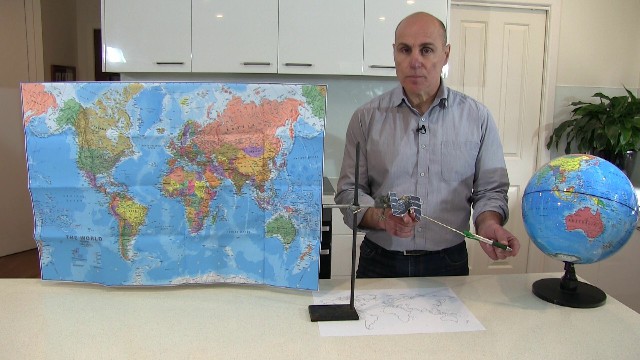
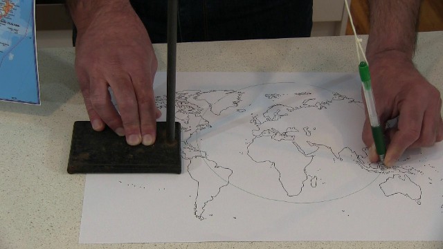
I can show you the basic principle using some paper and a light globe.

 I’ve drawn a rough outline of the world’s continents onto the globe. If I wrap the paper around the globe, the outlines are projected, that’s the word that is used, projected onto the paper. I can then, on the paper, trace over where the lines are. There’s Australia, Africa, the Americas… I’d hate to admit it, but I did a few takes and this was the best one. Once I’ve traced the lines, I can unwrap the paper and I’ll have a flat map of the world. Flat but still distorted.
 So, let’s say that there’s a gigantic red island in the Pacific Ocean near the equator, and another same-sized gigantic blue island, further north. I can draw arrows from the centre of the Earth to the upper- and lower-most points of these fictional islands and then project the arrows further onto the flat paper which is curled around the globe. If you looked at the paper from the side, the red island’s size on the flat map would be kind of similar to its size on the curved globe, but the blue island’s size on the flat map would appear much larger than it really is.
Another way to draw a world map is to project directly outwards from the globe, but this results in a different distortion, where the blue island would now appear significantly smaller than it really is.
Here I’ve stuck three identical round pieces of aluminium onto the globe. If I hold a flat paper up against them, the distortion is pretty clear. The projection of the circle that’s furthest from the equator is much larger than the actual piece of aluminium.
As I said, there are lots of different ways of making projections of the Earth, and it’s all done mathematically, not with paper, but every single projection includes some distortion.

This map of the world is called the Mercator Projection. It’s named after Belgian geographer and astronomer Gerardus Mercator who developed it in the 1560s. Areas near the equator are roughly accurate but sizes of countries become more and more exaggerated as you move further and further away from the equator. Greenland, for example, is huge on the Mercator Projection and appears to be much larger than Australia, even though in real life Australia is actually about 3½ times larger than Greenland. Africa in real life is about 14 times larger than Greenland but it certainly doesn’t appear that way on this map.

This animation is moving between the Mercator projection and a map that shows the sizes of the countries to scale. There’s a significant amount of size distortion.
Now, despite the size distortion, the Mercator Projection is very useful for navigation, which is what it was originally designed for and for which it’s still used today.
So, why is it so useful for navigation?
Well, firstly, north is always at the top of the map no matter where you are. This is not true for lots of other projections. The lines of longitude on a Mercator Projection don’t meet at single points at the North Pole and at the South Pole; they’re all straight. This means you can’t show the North Pole or the South Pole as single points but for most of us that’s not a deal breaker because how often do we go to the poles? Secondly, on a Mercator Projection, angles and directions are preserved.


So, for example, the angles between these roads, AND the directions that they’re all pointing in are all preserved very well when they’re mapped using the Mercator Projection. Remember, map projections aren’t just for the whole Earth, you can use the Mercator projection to create maps of small regions as well. Likewise, the angles between all these islands and therefore the direction you have to travel to get from one island to another is the same in real life as it is on a Mercator Projection. This is obviously very useful for navigation purposes, so most sailing ships in the past 400 years or so carried Mercator Projection maps, and most modern ships still do as a back up.
 Now online maps use slightly modified versions of the Mercator Projection. One of them is called Web Mercator. Web Mercator uses very clever mathematical formulas to map actual latitude and longitude co-ordinates of landmarks onto a flat screen and the formulas take into account how much you zoom in or out. The actual images in satellite view and on Google Earth are taken by cameras mounted on either satellites or planes and then they’re stitched together so that the roads and buildings and other things match their actual latitude and longitude co-ordinates.


So, we have a map. How does our phone pinpoint our location and display it on the map? Well, that’s where a fleet of about 30 GPS satellites come into it.
Online maps and GPS location services use a fleet of about 30 GPS satellites that are orbiting the Earth at a height of about 20,000 km. They’re tracked by ground stations and so their exact location is known and they carry extremely accurate atomic clocks on board so that they know exactly what time it is. They continuously send out coded signal pulses with data that states exactly where they were when each pulse was sent AND the exact time that each pulse was sent. The simulation shows that at any given time, there are at least 6 satellites that have a direct line of sight to our phones. They’re said to be “visible” satellites.
When our phones receive the signals, which are all received at a slightly different time, depending on how far we are from the satellites, the software can use the difference in the times to calculate how far we are from each satellite. It then works out our latitude and longitude and then displays our location on the map.
So, let’s just say that a GPS satellite is exactly 20,000 km directly above you. The speed of the signals that GPS satellites send is 300,000 km per second. They travel at the same speed as light because they’re the same kind of wave. Now speed = distance divided by time so it follows that time = distance divided by speed.
So how much time does it take for the signal to reach you? Let’s do a simple example first. At a simple level, if you want to travel 200 km at a speed of 100 km/hr, it will take 2 hours.
The time it takes a 300,000 km/s GPS signal to travel 20,000 km is 20,000 km divided by 300,000 km/s which is 0.067 seconds or 6.7 hundredths of a second. That’s a very small amount of time but the electronics can handle it. Obviously, the time will vary depending on where you are. If you’re standing here, holding Phone 2, the signal will reach you in 0.068 seconds, which means you must be 20,400 km from the satellite. Mathematically, distance = speed times time, so 300,000 km/s times 0.068 seconds = 20,400 km. If you’re standing here holding Phone 3, the signal will reach you in 0.071 seconds, which means you’re 21,200 km from the satellite, since 300,000 km/s times 0.071 seconds = 21,200 km.
So if the signal is sent at exactly 11 am (and by “exactly” I mean to the nearest nanosecond, the clocks on GPS satellites are really accurate), Phone 1 will receive the signal at exactly 11 am and 0.067 seconds. Not 10 minutes past 11, not 1 minute past 11, not 1 second past 11, but 0.067 seconds past 11. Similarly, the other two phones will receive the signal at 0.068 seconds past 11 and at 0.071 seconds past 11. Since the signal tells each phone when the signal was sent, our phones do a few calculations and work out how far they are from the satellite.

Now the problem here, is that this phone, for example, is at a distance of 21,200 km from the satellite, but so is this phone, Phone 4, and so is every phone that’s on the pink line and on an identical line that’s behind the Earth from our point of view. The pink lines trace out a circle in fact.
So, if this is the satellite, and you’re on the Earth, and the phone calculates that you are exactly this far from the satellite, where are you?
Well, you could be here, or here, or here, or anywhere on this circle. One GPS satellite, on its own, isn’t very useful. We actually need a minimum of three satellites to work out our position.
 So, let’s look at it from above in 2D. Remember, the satellites are about 20,000 km above the Earth. As I said, they continuously send out coded signal pulses with data that states their exact location when each pulse was sent AND the exact time that each pulse was sent. Let’s say my GPS receiver calculates that it’s this distance from Satellite 1. Well, I could be anywhere on this circle. If the receiver also calculates that it’s this distance from Satellite 2, it could be anywhere on this circle. The software has now narrowed down the location to just two points, here or here. If, with the signal from Satellite 3, it calculates that it’s this far away from Satellite 3, I must be somewhere on this circle, so the only place that I could be is here, where the three circles meet. I am in fact in Athens, Greece.
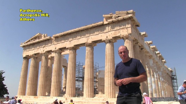 This is the famous Parthenon on the Acropolis Hill in Athens.
This technique of using a minimum of three satellites to pinpoint your location is called trilateration. You need really accurate and synchronized clocks for it to work. However, the accuracy of the clocks on our phones is really only accurate enough to find your location to the nearest 300 metres or so.
Our phones actually use a fourth satellite, which can pinpoint our location down to an accuracy of about 5 metres, and here I am back in Melbourne next to the Yarra River. However, as I said earlier, specialized GPS receivers can pinpoint their location down to a few centimetres!
 GPS devices (not only our phones but also on planes, for example) use latitude and longitude to guide us to exact destinations (or in other words, to “stay on target”). People involved in the space industry use latitude and longitude co-ordinates to position telescopes or to launch and track satellites and other spacecraft from precise ground points.
Knowing all about latitude and longitude, and about rocketry, electronic communications, and how satellites behave as they orbit the Earth, is really important and really useful. Thanks for watching. See you in the next episode.
CREDITS:
Opening and end titles music by Humanoide_Media via Pixabay.
https://pixabay.com/users/12661853/?tab=music&order=latest&pagi=1
https://pixabay.com/music/main-title-star-wars-style-march-165111/
https://pixabay.com/music/main-title-invasion-march-star-wars-style-cinematic-music-219585/
Star-Wars-style opening crawl generated at the STAR WARS Intro Generator website. https://starwarsintrogenerator.com/
Stay On Target (Beats MV) by Ishaanvi Fun With_Official: https://youtu.be/kUEiDHlEiAo?si=F1CFPetZ7-Ygd365
GPS24goldenSML.gif by Paulsava: https://en.wikipedia.org/wiki/File:GPS24goldenSML.gif
File:Worlds animate.gif by Jakub Nowosad: https://commons.wikimedia.org/wiki/File:Worlds_animate.gif
Google maps by Google and Google Earth Studio: https://www.google.com/maps/ and https://www.google.com/earth/studio/
Map of Globe by TUBS. Creative Commons License https://commons.wikimedia.org/wiki/File:Papua_New_Guinea_on_the_globe_(Southeast_Asia_centered).svg
.svg)